
Every year, Pantone unveils a shade that captures more than just visual appeal—it mirrors the global zeitgeist. For 2025, the spotlight falls on Mocha Mousse, a rich, earthy tone that symbolizes warmth, stability, and connection. More than just a color, Mocha Mousse is a statement about where we are and where we’re heading.
Marketers are aligning their marketing strategies to incorporate this versatile shade, using it to build trust and emotional connection with audiences.
The selection also highlights an emerging trend—businesses shifting toward natural tones and minimalism to reflect clarity, balance, and meaningful engagement. Those who understand the deeper message behind color psychology will find in Mocha Mousse a powerful tool for communicating brand values and shaping perception.
What is Pantone?
Headquartered in Carlstadt, New Jersey, Pantone forever changed the world of design and production with the introduction of its revolutionary Pantone Matching System (PMS) in 1963. What began as a tool for consistency has evolved into the universal language of color.
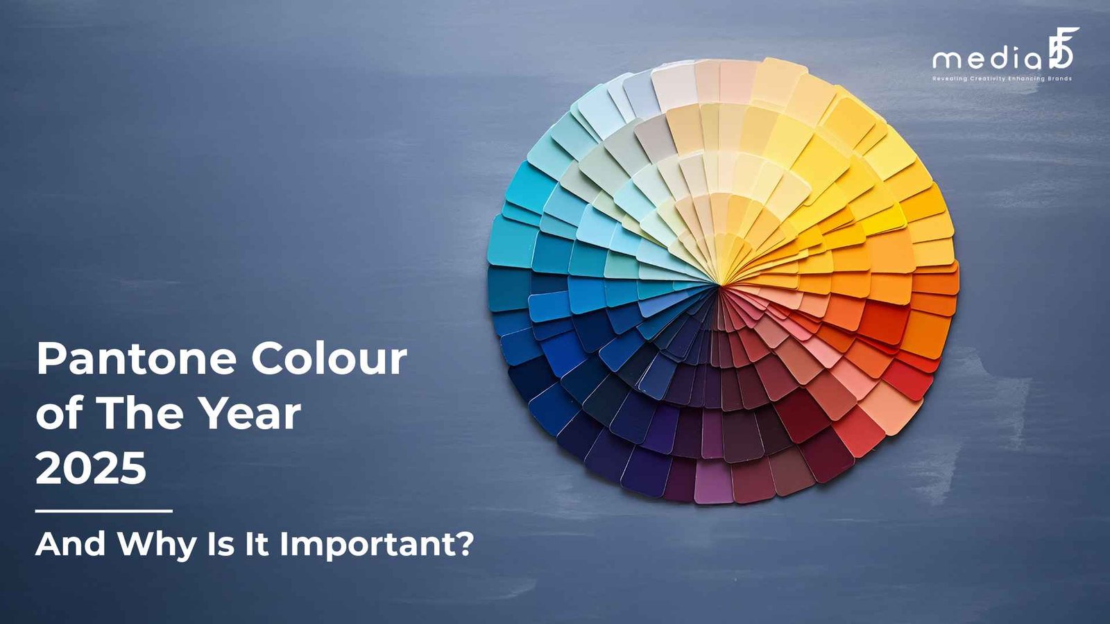
Think of a Pantone Color as a unique coordinate on a global color map—precise, standardized, and universally understood. With over 2,000 carefully defined shades, the Pantone Matching System allows designers, printers, and manufacturers to speak the same color language, ensuring flawless communication and consistency from concept to final product.
Whether it’s a branding project, packaging design, or textile production, the Pantone Matching System ensures that every hue is replicated exactly as intended, no matter where in the world it’s produced. It’s more than a color guide—it’s the foundation of trust in a visually-driven marketplace.
Why is the Pantone Matching System important?
Solving the Language Barrier of Color
Describing color with words often leads to confusion—what one person sees as “Ocean Teal” might look completely different to another. The Pantone Matching System (PMS) removes this guesswork with precise identification.
A Universal Language for Color Accuracy
PMS assigns a unique number and formula to every shade, enabling brands, designers, and manufacturers to communicate color specifications with absolute clarity, no matter the industry or location.
Global Consistency, Local Execution
Whether you’re a designer in Ahmedabad or a printer in New York, Pantone ensures that the exact hue remains consistent. It bridges geographical divides to maintain color fidelity worldwide.
Visual Tools for Instant Clarity
Pantone’s physical and digital color guides—resembling fan decks—offer quick, accurate reference points. With versions for coated and uncoated paper, it accounts for how surfaces affect final color appearance.
Cross-Industry Relevance
From fashion and interior design to product packaging and advertising, Pantone is the backbone of visual branding and design precision, ensuring everyone is on the same page.
Minimizing Errors, Maximizing Impact
By standardizing colors, PMS reduces costly production errors and mismatches, leading to flawless color execution across all stages of creative development and manufacturing.
Mocha Mousse: Pantone’s 2025 Color Shaping the Future of Marketing
- A Subtle Force with a Strong Impact :- Pantone’s Color of the Year isn’t just a trend—it’s a strategic tool. For 2025, Mocha Mousse (Pantone 16-1333) brings warmth, depth, and meaning to the evolving world of marketing.
- Color Drives First Impressions :- Studies reveal that up to 90% of initial consumer judgments are based on color. Integrating Mocha Mousse into branding can instantly influence perception and build trust at first glance.
- Emotionally Aligned with Today’s Consumer :- Mocha Mousse speaks to the current global mood—comfort, calm, and grounded sophistication. It offers a sense of stability in a fast-paced world, aligning perfectly with today’s emotional needs.
- More Than a Trend—A Branding Asset :- This earthy, refined shade has the potential to become a core visual identity element. It enhances brand storytelling with emotional depth while promoting a look of modern elegance.
- Versatility Across Platforms :- Mocha Mousse adapts well across digital and print—from social media graphics and websites to packaging and advertising. Its neutral tone makes it both eye-catching and easy to pair.
- Strategic Use Boosts Engagement Leveraging this color in visual storytelling creates harmony and consistency, which strengthens emotional connections and improves audience engagement and recall.
- Cultural Relevance Meets Consumer Psychology :- Tapping into Pantone’s annual influence connects brands with cultural trends and consumer psychology, reinforcing relevance in a visually saturated market.
- Future-Proofing Your Visual Identity :- Incorporating Mocha Mousse signals awareness and innovation, showing your brand is in sync with design evolution and broader market dynamics in 2025.
Conclusion
As we step into 2025, Mocha Mousse, Pantone’s Color of the Year, stands as more than a trend—it reflects a collective desire for stability, warmth, and genuine connection. In a fast-paced, ever-evolving world, this grounded hue resonates deeply with the emotional pulse of consumers.
Much like the Pantone Matching System, which standardizes global color communication, Mocha Mousse offers marketers a consistent and meaningful way to visually connect with audiences. Its rich, earthy tone becomes a strategic asset—enhancing brand identity, fostering trust, and aligning messaging with today’s cultural climate.
By embracing Mocha Mousse across branding, design, and communication touchpoints, businesses don’t just stay relevant—they lead with intention. This color speaks to the moment while offering timeless appeal, helping brands cultivate emotional impact and future-proof their visual presence in a competitive, design-driven world.